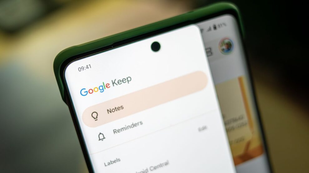
Google Keep, the popular note-taking app from Google, is in the process of rolling out an update that significantly tweaks its user interface, introducing a floating bottom bar along with other Material You design elements. This change aims to modernize the app’s look and feel while enhancing usability and access to various functions.
Key Highlights
- Floating Bottom Bar Integration: Google Keep is enhancing its user interface by incorporating a floating bottom bar.
- Material You Design Language: This update aligns with Google’s Material You guidelines, promoting a unified and aesthetically pleasing design across Google’s app ecosystem.
- Enhanced Usability: By reorganizing key features and actions into a more accessible floating bar, Google Keep aims to improve overall user experience.
- Server-Side Update: The new features are being rolled out via a server-side update, meaning that they will become available to users gradually.
The introduction of the floating bottom bar in Google Keep is part of Google’s broader effort to update its applications with the Material You design language, which emphasizes customization, ease of use, and a cohesive look across devices and platforms. Material You is known for its dynamic color themes, rounded corners, and more personalized user interface elements.
In the specific case of Google Keep, the update moves the action buttons and the new note entry point to a more visually prominent and accessible location at the bottom of the screen. This change not only follows the Material You design guidelines but also addresses usability by making it easier for users to create new notes and access important features without having to stretch their fingers across large screens.
The floating bottom bar includes several key components:
- Pill-shaped Container: The bottom bar is designed as a pill-shaped container that houses key navigation tabs and the new chat floating action button (FAB).
- Simplified Navigation: The bottom bar simplifies navigation within the app, providing quick access to home, direct messages, spaces, mentions, and the ability to start a new chat.
- Overflow Button and Sheet: An overflow button has been added to manage additional features, replacing the Mentions icon in the bottom bar. This change aims to adhere to Material You guidelines that recommend limiting navigation bar destinations to maintain clarity and prevent clutter.
This update is part of Google’s ongoing efforts to refine its apps and services, ensuring they remain competitive and meet the evolving needs of users. The new floating bottom bar and the adherence to Material You design principles not only enhance the aesthetic appeal of Google Keep but also improve its functionality, making it a more intuitive and user-friendly tool for note-taking and organization.
For more detailed insights and visuals of the floating bottom bar in action, readers are encouraged to check out the full articles on 9to5Google and another article on 9to5Google from 2019, which provide a comprehensive overview of the updates and their implications for Google Keep users.

